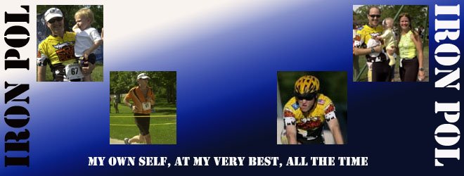
For those of you familiar with the site, you might have noticed a minor change at the top of the page. It was long overdue that a new header be put there. The initial transformation that started at the beginning of the year is well underway, and the journey has shifted focus from "become a triathlete" to "become an Ironman."
Mrs. Pol was probably the first to make the call that this would be about more than one summer spent learning to swim enough to complete one short race. Perhaps the title "Iron Pol" was freudian, revealing more about myself than intended. Sometimes, simple statements reveal a great deal about who we are and where we are going.
The original plan was to put the basics together, and have Little Miss Runner Pants make it presentable. She looked at the two versions I sent her and said that she could do little more than recreate them. She did, however, give her two cents worth as to which header to use. I would have expected nothing less.
So, the header is there. I have one final piece to add, but it may take a while to find or create. Until then, I'll go with this.
Please let me know your thoughts. And don't worry about hurting my feelings if you have critical comments. I have no delusions of being an amazing graphic artist or designer. Any constructive comments will be greatly appreciated. And if you just want to tell me how amazing I am, that's fine, too.
skip to main |
skip to sidebar

About Me
Team raceAthlete News

raceAthlete Sponsors


Blogs Worth Visiting
- Athena Diaries
- Bigun
- Bolder
- Comm's
- Curly Su
- Duane
- Dying Water Buffalo
- Fe-Lady
- Flatman
- Geek Girl
- Iron Benny
- Iron Snoopy
- Iron Wil
- Jay (aka Tri Dummy)
- Kewl Nitrox
- Lisa in Madison
- Little Miss Runner Pants
- LP (Go Mom Go)
- Myles
- Nancy Toby
- Neoprene Wedgie
- Nytro
- Sascha
- Simply Stu
- Stronger
- Taconite Boy
- Tri Geek Dreams
- Tri Mama
- Tri-Daddy
- TriBoomer
- TriGreyhound
- Veeg
- Wrenching with Winz
Training Partners

![]()
Blog Archive
-
▼
2006
(197)
-
▼
November
(41)
- Waiting in Line
- And Done!
- 'Cause They're Fast!
- Two Seven Oh
- Fire and Ice
- Monster Girl Version 1.0
- Swim, Rinse, Repeat
- Look At Those Cars
- Start Early, Finish Late
- Gotta Run
- Header
- All Clear
- Godparents
- Blogger's Cramp
- Swimulation #2
- Ska AND 80's Tunes
- Go Figure. Here We Go, Again.
- Bloggities
- Roadblocks
- By Special Request
- Ska Week!
- Header Help
- Day Off
- Like Christmas in, Um, November
- Blog Ruling
- Stunned
- Finisher Videos
- Roll the Odometer
- Growth Potential
- Bottle the Energy
- The Longest Yards
- Nancy News
- Then There Was One
- Bold Lives Boldly
- Run, Bloggers, Run
- Bike Updates
- IM Flipper Updates
- Something's Missing
- Change
- Loaded Deck
- Beware of What You Wish
-
▼
November
(41)
All information on this website is Copyright © 2006-2007 by Iron Pol. No portion of this website may be reproduced for commercial use without the express written consent of the owner. Authorization is granted for use on personal sites. Proper credit and recognition is greatly appreciated.
8 comments:
I like it, but there is something missing in the middle...maybe I can help you find the missing piece..? Describe it to me. :)
looks like you've got a background piece in the works, but I like it - just 2 cents - you seem to be a "yellow" guy - you should put some more yellow in to your lettering to match your shirts - coincidence.....I just put mine in last night too.....hmmm - how's the 30/30 going? It has to be tuff around the holidays - that's why I start Friday.....
I like the header.
And I like the Freudian reference regarding "Iron Pol" -- I swear I never thought of that, and I'm usually the first to pick up on something like that. I feel outclassed :-)
I dig it. I agree though about the yellow. Maybe make your background blue to blend with the header?
Not sure what exactly I would change, but overall, I dig it. :)
Interesting concept about the background theory. There has to be a way to expand the whole thing. Of course, I have to make sure I don't loose the ability to see some of the other things.
But worth looking into.
Interesting concept about the background theory. There has to be a way to expand the whole thing. Of course, I have to make sure I don't loose the ability to see some of the other things.
But worth looking into.
I don't think you are happy with it and your the one your really trying to please. Don't short yourself.
A banner needs to accomplish certain things right away, 1)please the author 2)capture peoples attention so they surf past you 3) reflect you, your goals, your blog style.
Yoohoo! Kewl header in my books. Then again, I am not amongst those enlightened with the ways of a blog header so...
I like the picture of the snarl on the bike. :)
Post a Comment